Everything in life, including brand logos have evolved over time to increase their brand visibility. Here are top 8 brand logo evolutions which will leave you spellbound and leave behind a spark of creativity for you to give your brand logo a thought!
Domino’s Pizza
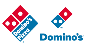
The original Domino’s logo had a semi-realistic red domino on one side and the Domino’s Pizza wordmark on the other. Later, in 1969, Domino’s debuted a more simplified design with a larger wordmark.

The red domino darkened with time, and the Domino’s Pizza typography was redesigned, this time in title case rather than all-caps. Domino’s launched a new logo in 2012 and deleted the word “pizza” from their name, claiming to be more than just pizza. That’s how the logo has been ever since.
Youtube
When Youtube’s initial logo was designed in 2005, it had a logotype with two parts: a black “You” and a capitalised first letter. The word “Tube” was printed in white on a rounded-angle gradient rectangle.
However, Youtube’s logo has evolved over time, and the new logo now allows for a more flexible design that works well on a number of devices, even the tiniest displays.

This update was required since the brighter icon may be used as a shortened logo that can be seen more readily when space is restricted, such as on smartphones.
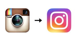
Like many others before it, the Instagram logo has changed over the previous 10 years. Three significant alterations have occurred in the logo design.

Starting from the basics, the company has finally settled on a brighter, more flattering choice. Rainbow, lens, and viewfinder – these features underwent renovations to become a more modern app symbol that finds a balance between identification and versatility.
Apple
The initial Apple logo was designed in 1976, and it depicted Sir Isaac Newton discovering gravity while sitting beneath an apple tree. The emblem was changed to an apple form with rainbow stripes.

It was subsequently simplified even further into a black-and-white silhouetted apple motif. The apple logo has been known as a monochromatic apple since the year 2000, and has not seen any changes since then.
Canon
Canon’s original logo was, in fact, far different from what would come later. It was a portrayal of the Buddhist Goddess of Mercy sitting on a lotus flower, encircled by flames, with hundreds of arms.

The next logo solely used distinct fonts and kept the ‘Kwanon’ brand name. By 1935, Canon’s logo had been altered to ‘Canon.’ That design was gradually improved until 1956, when it was transformed into the logo we see today.
Starbucks
Starbucks’ logo underwent the most notable change in 1987, when the company transformed a brown woodcut into a green and black design. It modified the siren from a 16th-century Norse woodcut to a more stylised black-and-white picture and removed the words “tea” and “spices” from the text.

As years passed by, the colours of the logo were changed from brown to kelly green to represent a new beginning, progress, and prosperity. Starbucks Coffee was additionally word marked with two stars on each side, providing a fresh way to link the emblem to the corporate name. Their expanding brand identity was simplified thanks to this easy play on words.
Visa
To bring out a change in the logo, Visa, for the first time, dropped the colour gold from it’s design. Visa’s wordmark now integrates a stronger shade of blue, trims parts of the lettering somewhat, and introduces a horizontal gradient, in addition to dropping Pantone 1375.

Visa opted to remove these colours from the logo in order for it to reflect everyone and everywhere. The new Visa logo was created to be readily recognisable, with a comparable colour scheme, making it more current and apparent.
Microsoft
Last, but not the least out of the top 8 brand logo evolutions is Microsoft. In 1980, Microsoft opted to update it’s logo for the first time, and since then there has been no looking back.

To produce a sharper look, the rounded, playful typeface of the late 1970s was replaced with a strong font that employed straight and angular lines. Another alteration which Microsoft made was becoming a single word and has remained so.
Final Words!
These top 8 brand evolutions left you star-struck, right? Thought so!
The Capturing Factory’s advice on logo creation? It’s simple – just create a logo with a timeless look and save yourself from trend changes!
Confused whether your logo suits your brand? Are you worried about your brand visibility and awareness?
Connect with The Capturing Factory and get in-depth solutions to all your brand problems!
P.S Don’t forget to check out our other blogs!

